Dear Reader, in this age of AI created content, please support with your goodwill someone who works harder to provide the human-made. Sign up at the top of the lefthand column or bottom of this page. You will receive my hand illustrated monthly newsletter RESTORE NATURE and access to the biodiversity garden design course as I write...and nothing else, I respect your time. I am also removing the advertizing as best I can as its become intrusive inappropriate and pays me nothing.
Cape flora and fauna prints
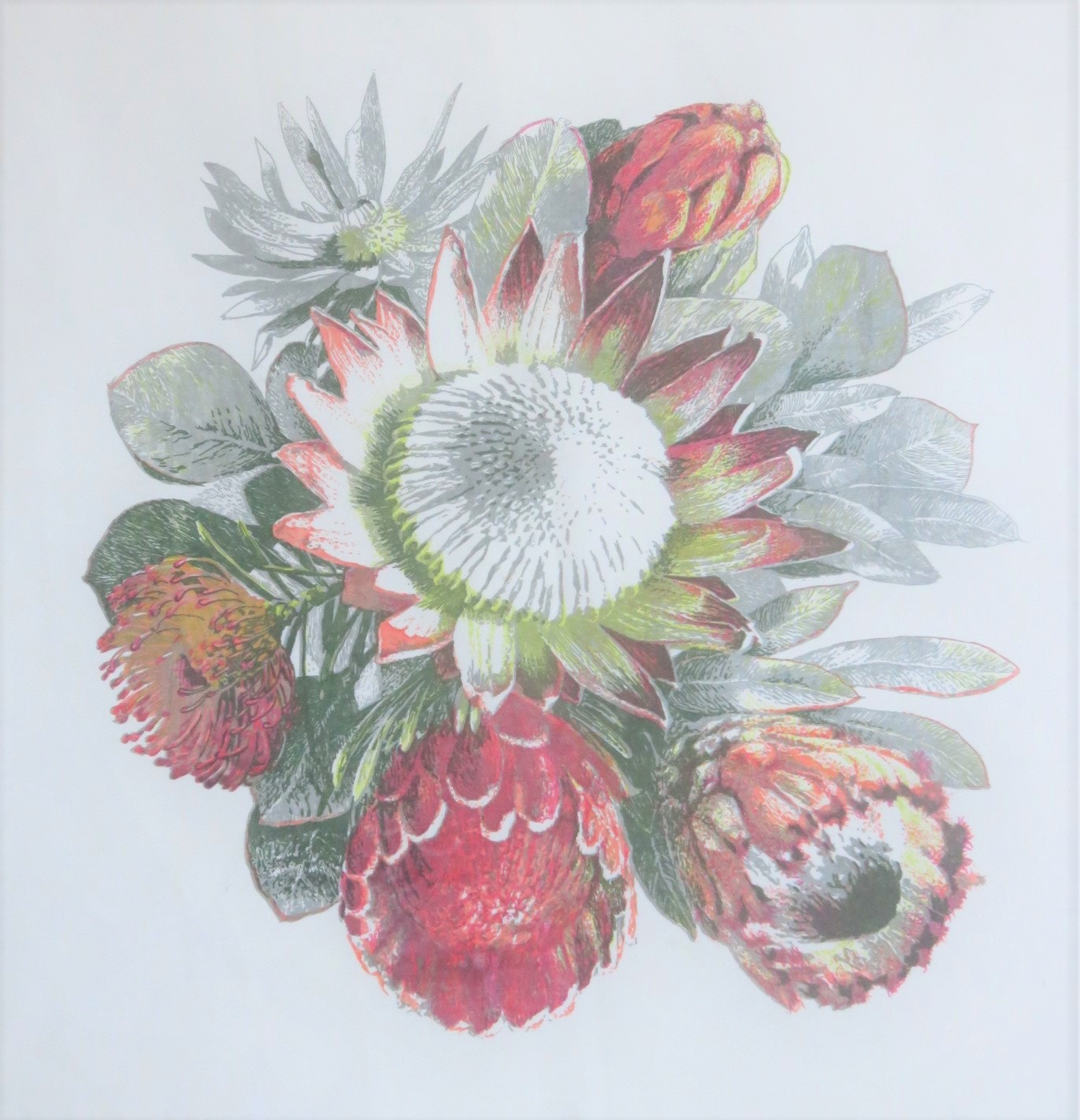 This is a seven color print in our flora and fauna design portfolio
You can view our Cape flora art prints, and buy them now online,
And you can view the fauna, or wild African animal designs
They are different to the hand made products we made in our craft studio at home for many years. Those one offs were all done by hand and are featured on Instagram. The new technology required adapting them digitally, and it gives a lot of freedom. In 2020 we hope to release all of our old range of South African nature prints and many new ones. They celebrate our exquisite and exceptional native flora, and the African animals that have been part of Fynbos ecosystems for hundreds of thousands of years.
You can see writing on our range of African animals here. We are also writing an iconography of our African plants. One by one we write feature articles on the motifs in the designs with cultural, horticultural or ecological strong points: see our wild flower designs The wild flowers of Darling, Zantedeschia aethiopica, Gladiolus carinatus, Geissorhiza radians, Protea cynaroides, Serruria florida, the red orchid Disa uniflora and a diversity of Asteraceae. Plants which are herbs and food plants are also featured, like Aloe arborescens. We will be adding new photographs of our prints for your enjoyment on a regular basis, and we hope to be very productive designing and adding new designs in 2020.
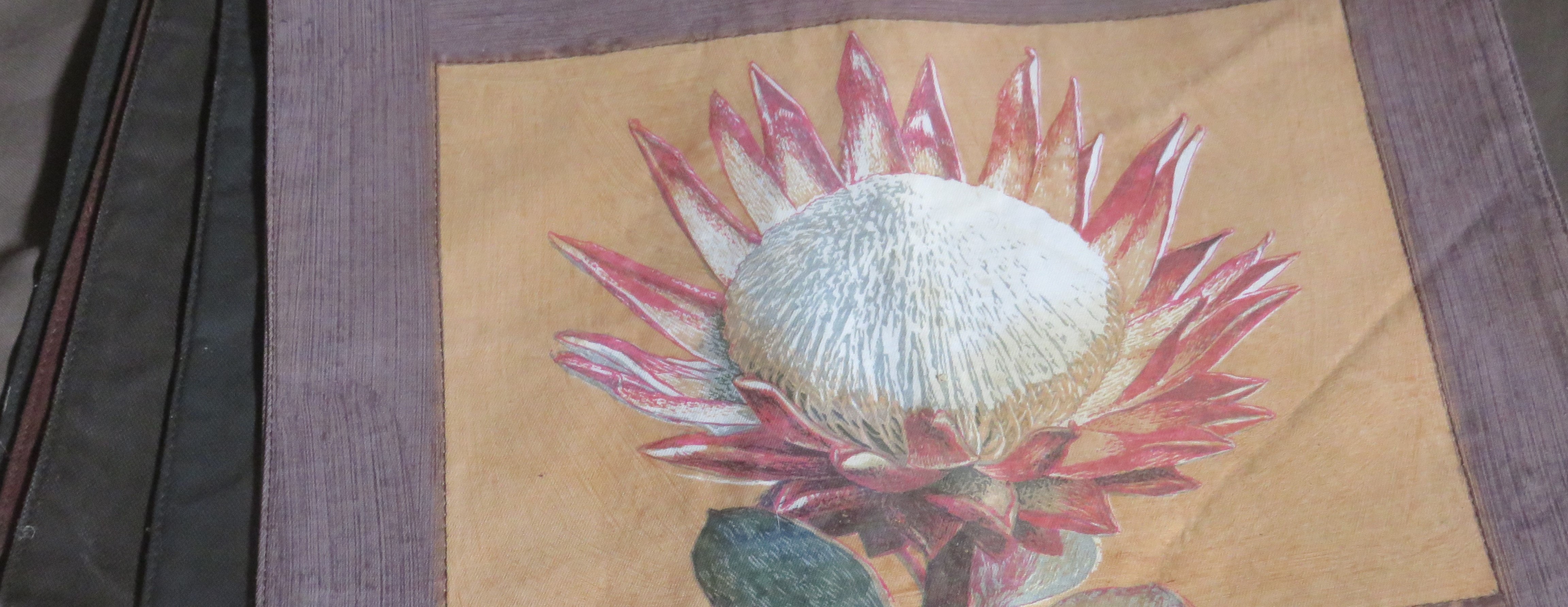 The King Protea is dominant in the symbolism of flora and fauna in South Africa,
Why use native flora and fauna in textile designs ?
One of the aims of the articles on flowers in our designs is to start building background for an iconography of South African plants, and a rough etymological study of the plant names.
Of interest to me are the symbolic meaning and uses of the plants, in legend, art, floristry, horticulture, medicine, and cuisine, and the meaning and origin of the names, be they Latin binomials, global common names, or the very local common names given by settlers and indigenous people. Behind this is not just the aim of amassing interesting trivia to enrich what is usually a purely scientific or botanical type of description and appreciation for the delight of online audiences and the sale of designs. For me it is a form of promoting conservation. The historical information one finds also quite often shows how we are all, in South Africa, deeply connected to this amazing Cape Floral Kingdom through our history.
At the moment I don't have access to a really powerful research engine, like a University library, so I supply what information I can find. In time, I hope I'll fill in any blanks, and there are massive ones.
The flora and fauna of our region is under threat. The basis of the whole ecosystem is the flora, especially with regard to insect and microbial diversity. The way this affects man the most is in the future of our food production, with pollination, soil and hydrology.
Our region, home to the Cape Floral Kingdom, is famed as being incredibly botanically rich. South Africa is home to more than 22 000 native seed plants from almost 230 different families. It also is the locality and origin of ten percent of the world's garden flowers.
Yet almost all the textile design in the world is based on the flowers of Eurasia. I want to help with turning our flowers into icons, like roses and tulips are icons. This means they would not just have botanical significance, but a cultural meaning. Eurasia has a deep story of plant iconography when used in painting and design. It is time we start telling this particular story.
The Khoekhoe people of the Cape had the longest relationship with the natural biology of this region, and the inheritance of this co-existence with local nature goes very far back in time, in situ, to the early history of humankind. They had stories for so many plants: buchu, water lilies and more. One of the biggest man-nature stories in the world has been severely compromised by local politics and the situation of the people who hold that inheritance.
I hope all the Khoekhoegowab stories about our plants will survive. But it is too late for that already. I hope a lot will survive. I hope that the descendants of the Khoekhoe will record the uses and meanings and stories surrounding our plants and compile them in a book form for posterity. Online information has a way of becoming erased very rapidly and is scarily transient unless you have archivists and people working on format changes all the time.
In recent times the plants have become logos and embroidery motifs in the commercial world. When something becomes iconic in a big way, tapping into the domains of art, history, identity, commerce and spirituality, it ceases to merely be a botanical curiosity, or part of a collector's list, and it becomes essential to us.
We can only respect and preserve what we love, and only love what we know. If we do not know about something it remains invisible. Turning our flowers into art is one way of spreading consciousness of them, therefore I believe that turning our flora into decorative motifs would help with conservation. Twenty years ago we were pioneers, not the first, but still too much alone to have a market. The world has caught up with the idea of the beauty of the Cape's flowers and now there are Protea textiles everywhere, even in Mr Price Home store at N1 city ! You couldn't get a clearer indication of the Protea's mainstream status in the décor market. I have also made textile designs featuring some of the less fashionable 'textile flowers'. I chose graphically impactful plants like Ferraria crispa or spider flower, and Geissorhiza radians, or the 'wine cup'.
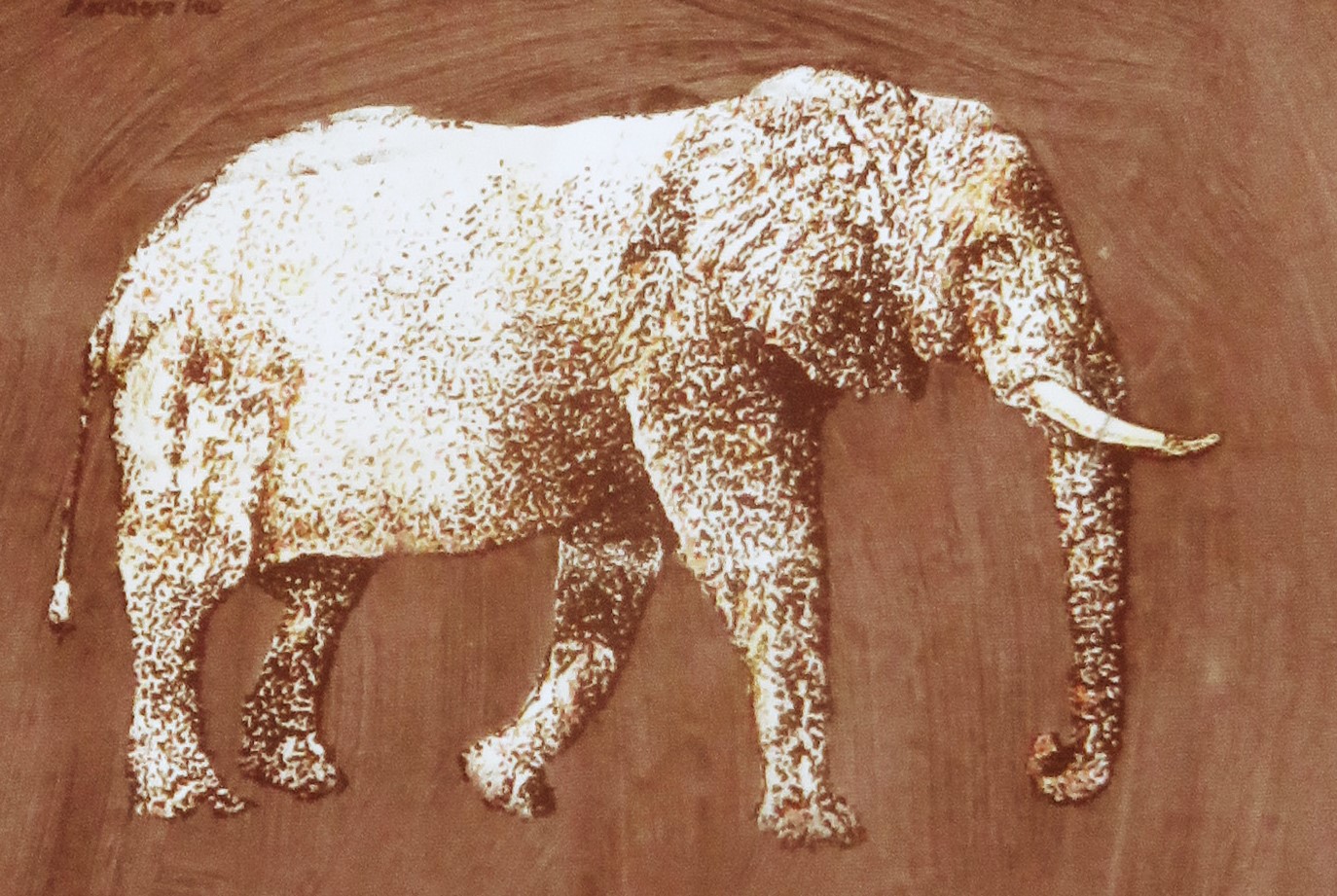 Elephant, four color print
Purchase our fauna and flora prints anywhere in the world
The flora and fauna prints can be purchased anywhere in the world, and will be printed from my original copyrighted hand drawings or hand drawn screen print separations by a company employing craftsmen in your country. We believe in supporting local craftspeople and local jobs, rather than shipping our goods half way across the world in a finished state and giving them a massive carbon footprint. We welcome the new technologies that make this possible.
We printed these designs for years ourselves, and our home became a tiny screen printing factory, each swipe of the squeegee being executed by my husband or his assistant. Now we are in the process of relaunching them on an international platform to make them available globally.
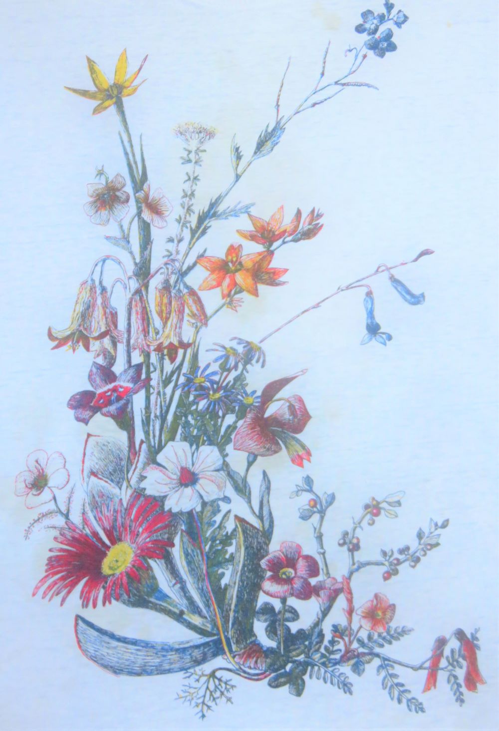
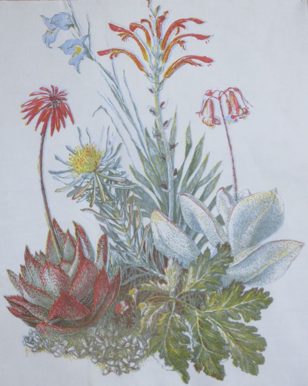 A selection of vegetation that grows on granite in the Renosterveld. A five color print.
Order your flora and fauna prints on fabric, paper or hard surfaces
My drawings can be printed on fabric, such as tea towels and cushions, T-shirts, mugs and paper (for wrapping gifts, or posters which can be framed). The orders will be made up individually for each customer.
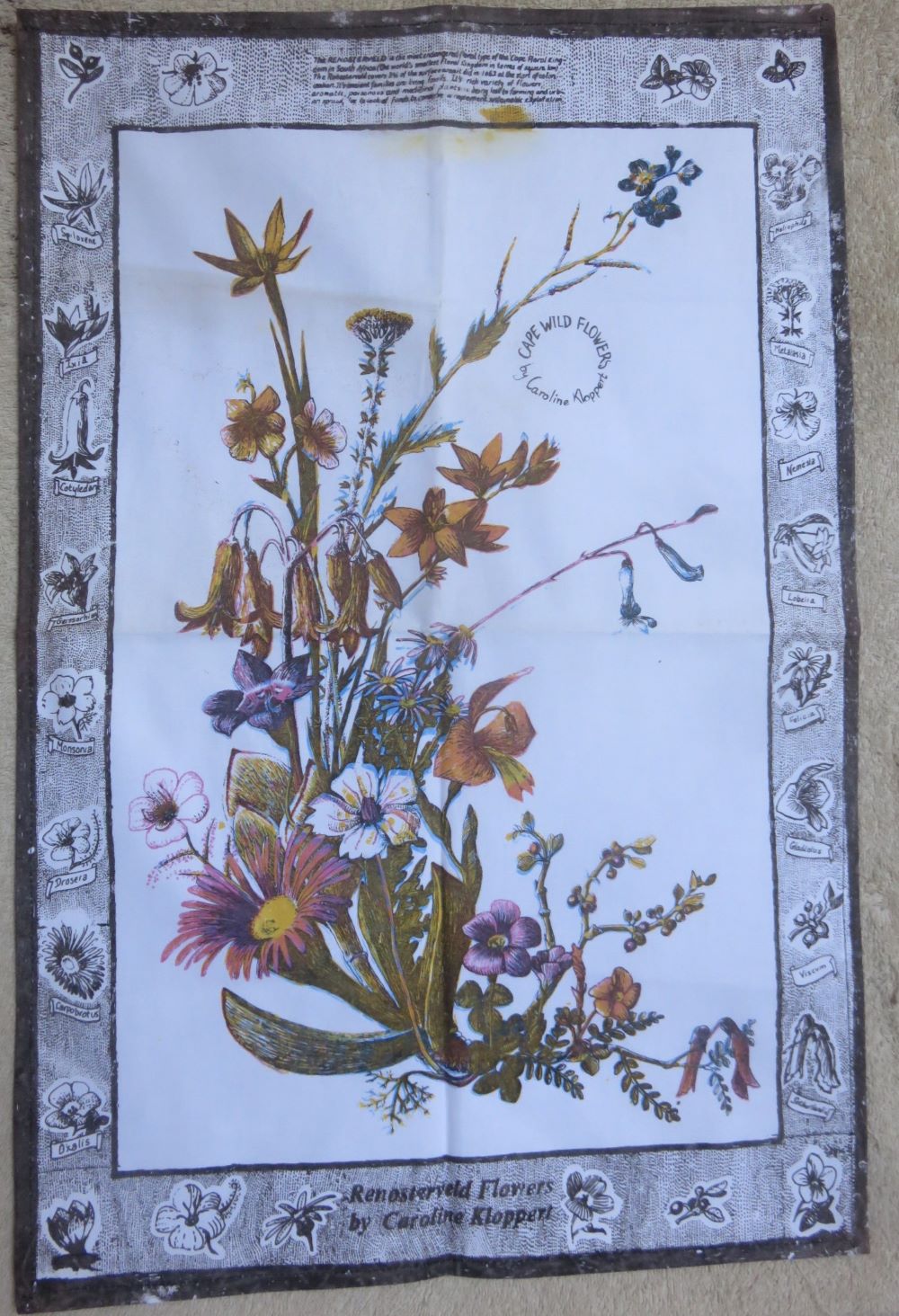
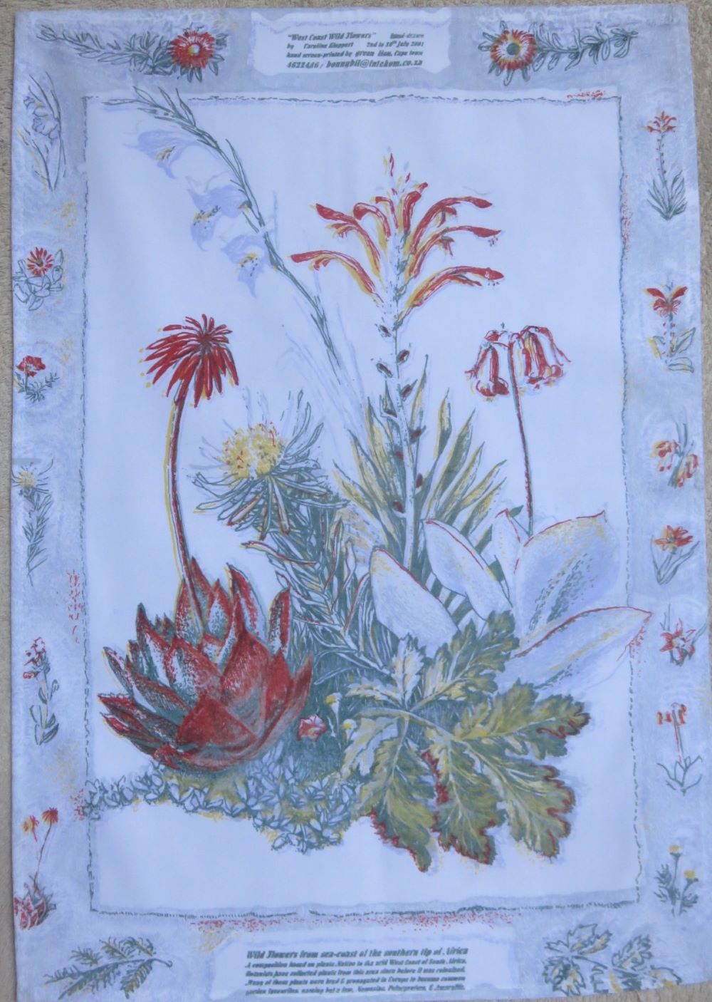 The same wild flower design with a border done for our old range of tea towels.
Please like our designs
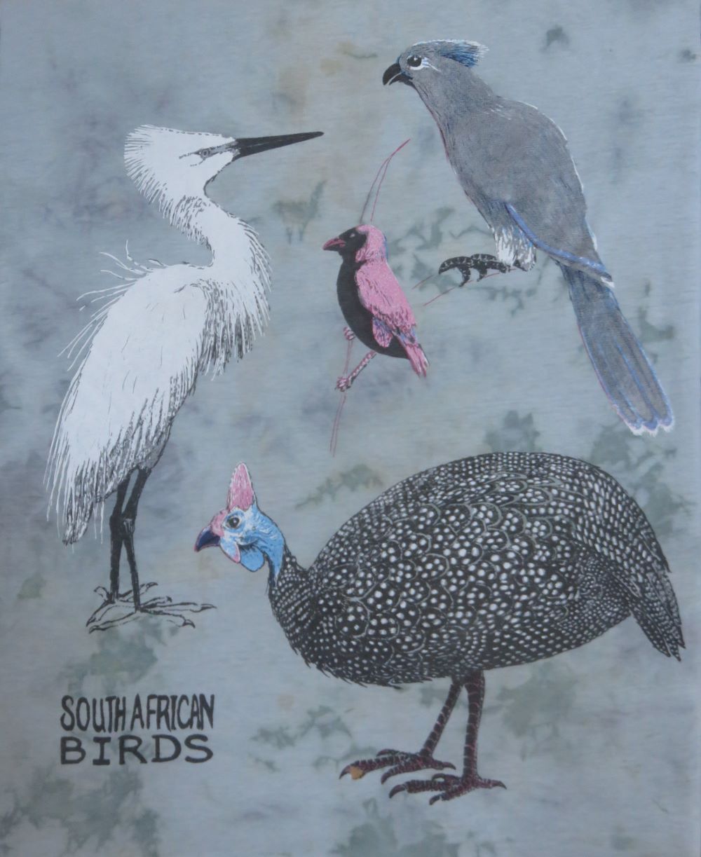
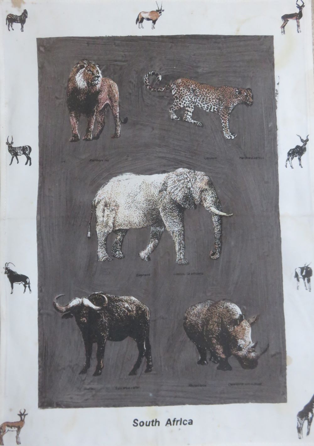
We have over a hundred flora and fauna designs and are discovering how to prepare them to work with the new technology. These photographs here are just a foretaste, taken from some finished screen printed samples we kept. We have started building an online catalog of designs and they can be purchased there and shipped anywhere. Please let us know which designs you like. This information is very helpful for growing the business. You can like this page using the facebook link, or like the individual designs on the sale platform, where the flora and fauna designs are featured. This would be very effective information gathering for us, and I thank you.
Our past screen printing process
This old print below is rather the worse for wear, and it was a 'reject' in our market. The
blue is off register and the yellow ink is incredibly muddy. The yellow also must have leaked out through a
hole in the yellow screen at the top of the print. I'm in the process of finding out how to redo
this art work digitally, so that the designs can be produced anywhere in a near to 'perfect' state, much more precisely than the hand done screen prints. The new flora and fauna digital prints should have perfect registration, perfect color and no blemishes, or blocked areas. These last can be seen in this print as white marks in the middle of black parts of the design. The screens often got blocked after many prints had been done, because of our hot weather in summer, when the most sales and the most production occurred.
The new digital process
Here below are my first attempts at turning our hand drawn positives into the digital format wanted by printers today. Our old positives consist of hand drawn ink lines on acetate. The drawing process could take up to a month for one flora and fauna design in several colors, as it did in the case of the most complex flower designs. Such a long and indirect process in which I was not able to see what I was doing with the color until it was printed, does tend to loss of the spontaneous appearance in ink drawings, especially my own, which can be really wild and messy.
When I asked for help, no one knew how to do this. New technology has completely drowned out the old, and the printing skills of yesteryear are not known, so there are no bridges between the old and the new. Here I started simple, with the fewest colors and simplest images until I could master this technological bridging. The animal designs usually fit the bill. The black outline color usually does the most work of description and almost stands on its own, but the softer gold and white, which have not yet been added below, give it some three dimensionality.
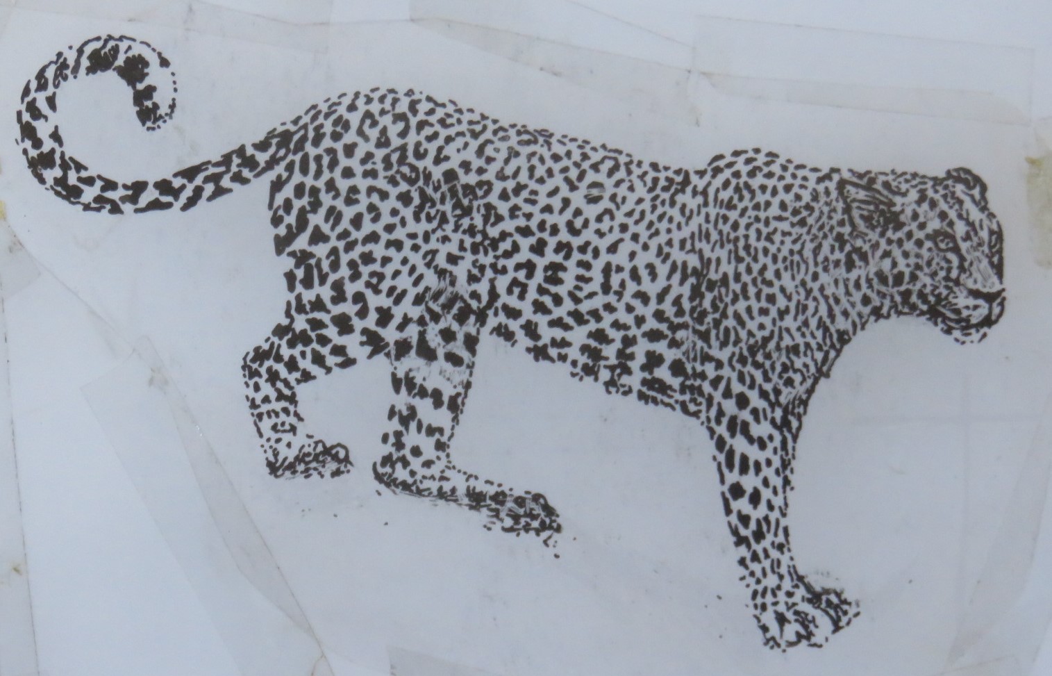 Above is a photograph of a hand drawn screen printing positive, on the right.... Above is a photograph of a hand drawn screen printing positive, on the right.... |
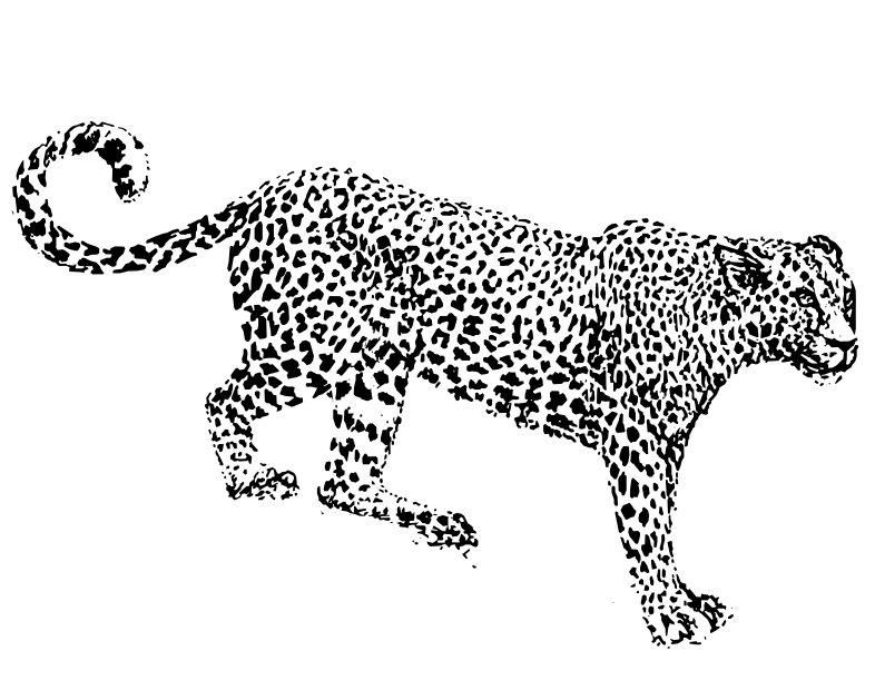 .....a new trick I've learned with Inkscape that converts it .....a new trick I've learned with Inkscape that converts it |
Digitizing all these designs is a bit intimidating, but they were all hand drawn and time consuming. I don't think it will take as long to digitize them as it did to make them, over a decade of work, with some designs taking months, because instead of using a camera to do color separations, I imagined them and printed them in non standard colors for which I created special recipes. Now I must standardize everything so that other people can print them.
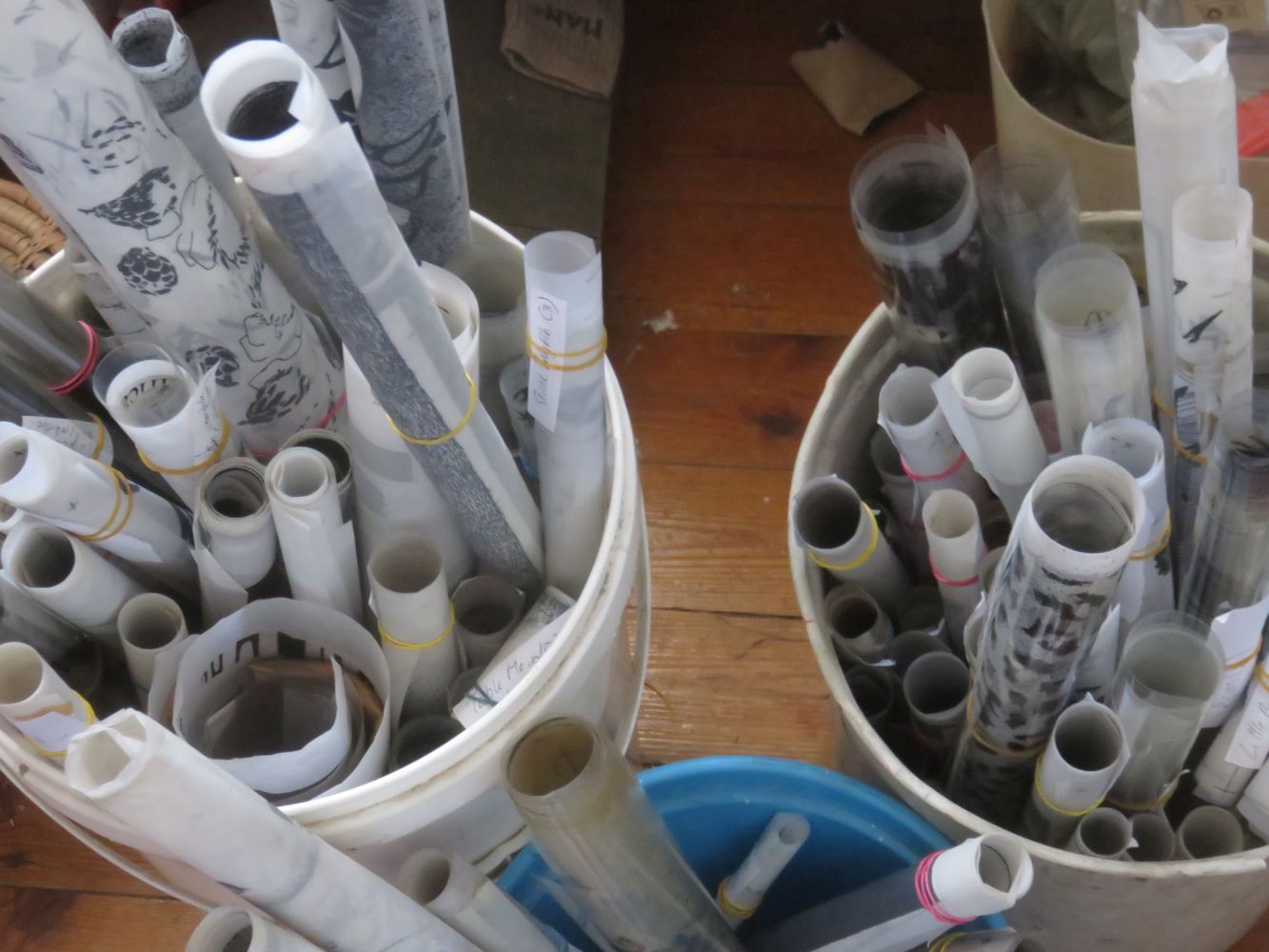 The flora and fauna designs were drawn on plastic, which is stored rolled up.
The image below is constructed from four black ink drawings, and after that is entirely digital, involving no actual screen printing. I've learned so much. There was a significant loss of detail in the flora and fauna designs due to my tiny camera, and its file sizes. I had to get up to all sorts of tricks to give it some weight in certain areas. I've since bought a scanner which has solved a lot of my problems with registration and file sizes. However the scanner is only A4 and I'm going to have to put together four scans for each color of the larger designs. I'm slowly getting the hang of that process. I use Inkscape freeware. It is really powerful where I need it to be and much simpler than Adobe just where I need it to be simple.
The photographs were taken on the most sturdy of my three tripods. I was particular about placing the artwork to be photographed in exactly the same place, but they still seemed to move enough, and there was a lot of distortion, so that I had to do a lot of painful fiddling to register the colors one on the other. I struggled with this for two days, and what we've got
is a compromise, merely an exercise, something that cannot be turned into
products yet. This below was my first attempt to digitize in several colors.
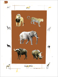 A digital version of the big 5 traycloth
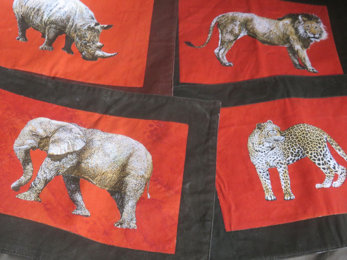
We had designs in many different versions of the big 5, in order to have the right shape and level of detail to accommodate all kinds of items, large and small. I developed some special hybrid screen printing techniques for getting slightly uneven painterly backgrounds, when there were flat backgrounds like those below.
 |
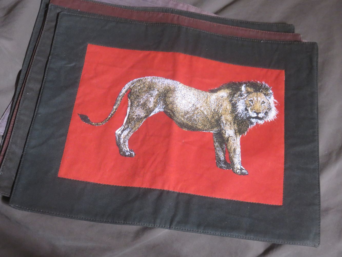 |
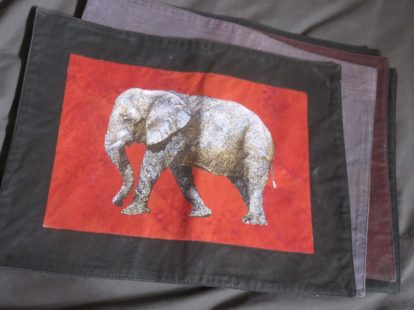 An actual printed version of the big 5 placemats.
The marvelous flora of the Cape region were one focus of our designing and set us apart from other producers a few years ago. These days fashion has caught up with the design potential in our own plants, and there is a much wider selection of products featuring Proteas and other South African flowers and plants. Below is a life size rendition of the spectacular king protea, or Protea cynaroides on a placemat.
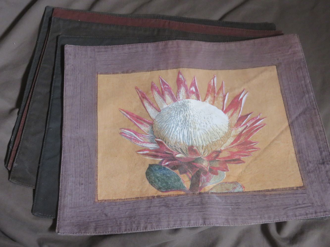 One of our protea placemats in 5 colours
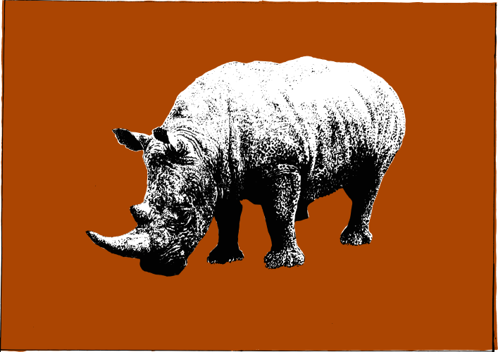
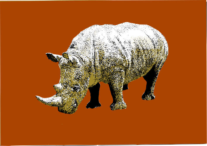
Each advancing step produces a new hurdle. On the left is a three color picture from photographs, and on the right from scans done at the corner copy shop. The scans seem to be infinitely better, even with their small file sizes. However in the process of merging all the colors together, the beige on the left became almost invisible, and that on the right covers the black so that the rhino gives a dazzling 'golden rhino' effect. I quite like it. I've since solved this kind of problem and it is surprising me less often. But there will never be an end to the learning curve I guess.
 |
 |
Designs based on paintings
After several months converting screen printing designs into digital designs the process is generally working a lot better and I'm often even able to pull out more color richness than was in the original design. Screen prints are done in flat colors.
For the sake of creating richer color I'm working from paintings now, rather than black ink on transparency, as for screen printing. In addition, screen print design is so indirect and painting allows me to see what I'm creating immediately. The first two paintings were done in watercolor on paper.
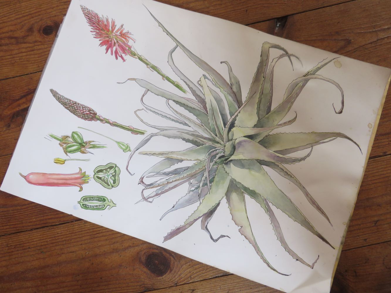 The second water color painting of Aloe arborescens
They have been published and can be ordered on diverse items from shower curtains to t-shirts. I'm not satisfied because the white of the paper shines through especially on black t-shirts, and it is hard to control tonal gradations and make them smooth and precise, and botanical painting requires extreme precision. I'm experimenting with acrylic now. Below you can see boards for the acrylic paintings on which I'm putting down a mid tone to dark undercoat. This is to try to prevent the chalky effect created by working on a white background and its negative effect on color when using a camera. Lucky me, I never work alone !
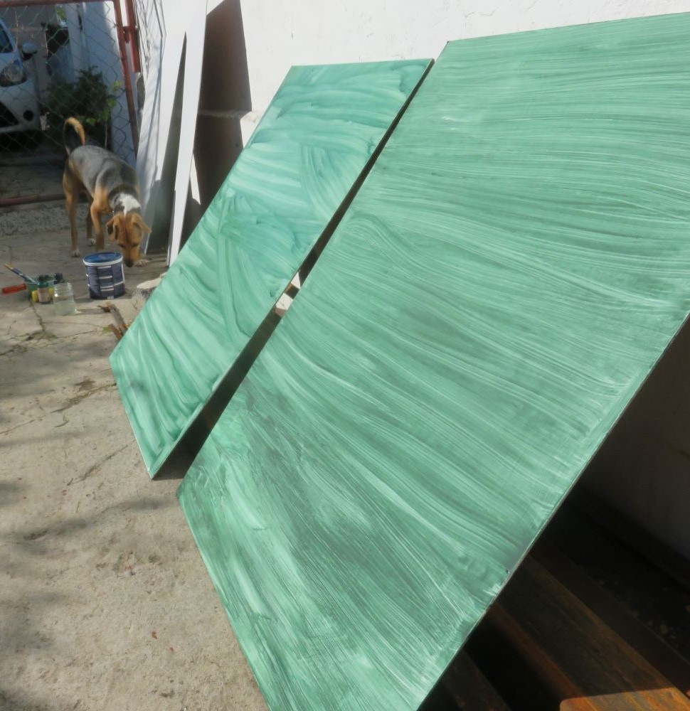 |
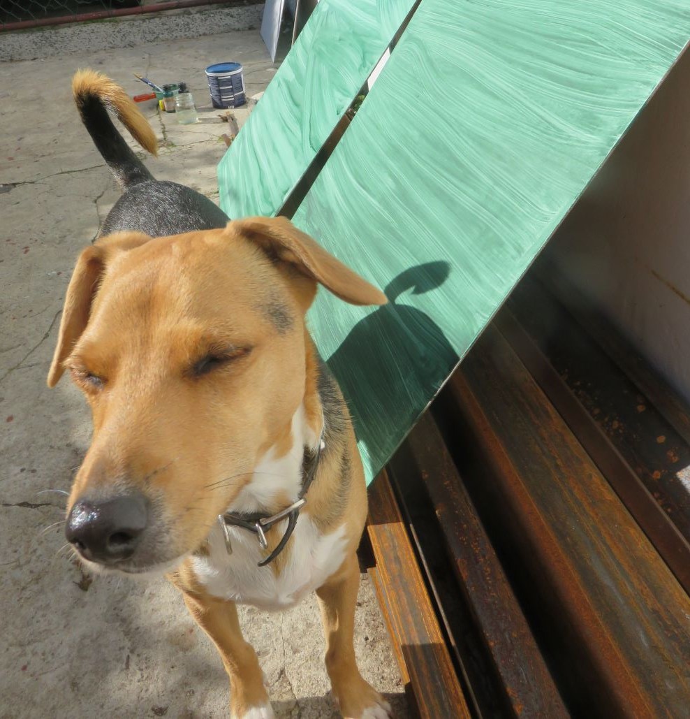 |
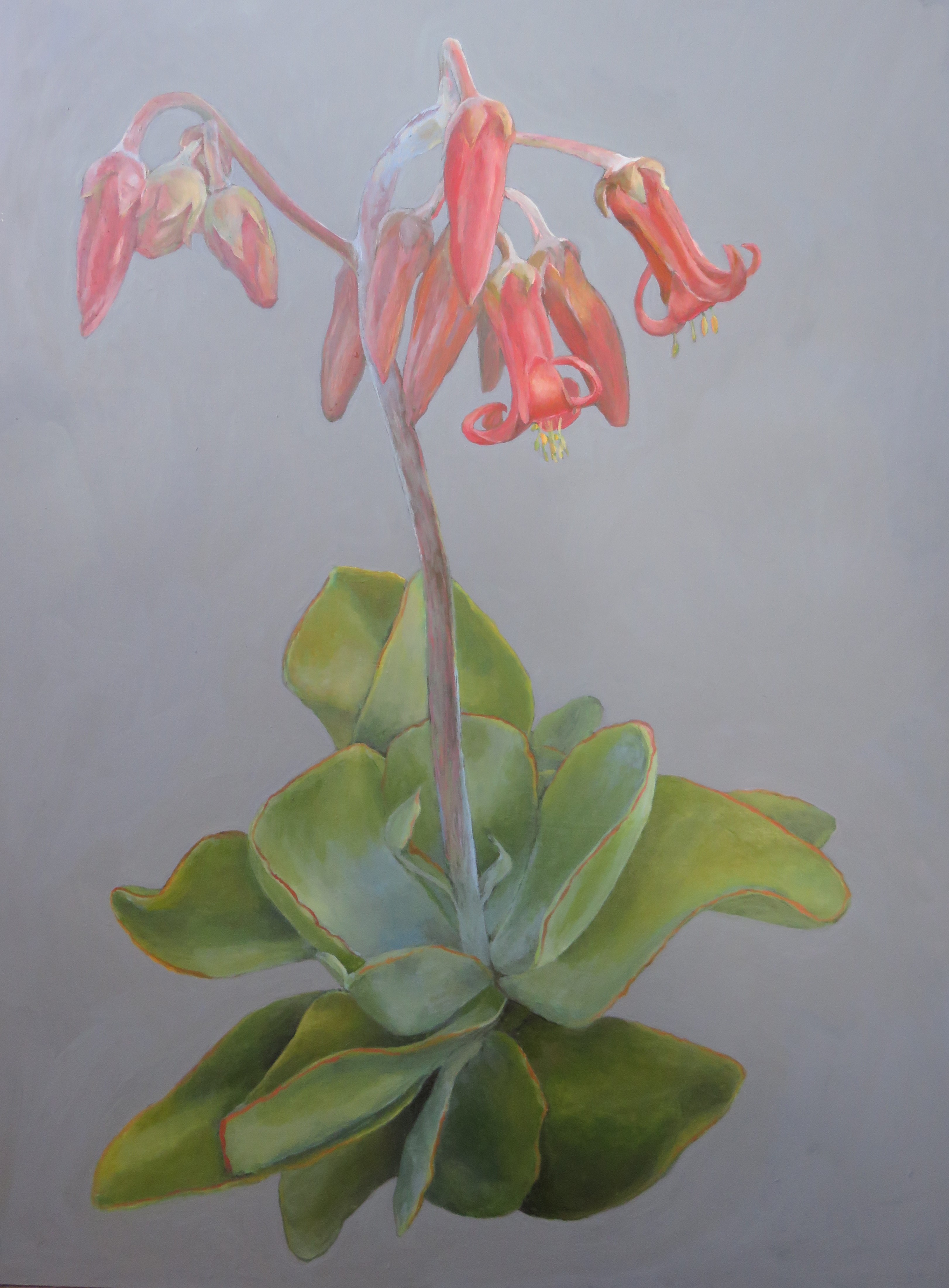 Cotyledon orbiculata painting August 2020, one of our indigenous medicinal plants. The first painting using the undercoated boards above. Prints available worldwide.
------
home page for links to articles on organic growing, food forests, perennial vegetables and more
------
------
Background stories to the designs
Asteraceae (daisies) in spring
Zantedeschia aethiopica (Arum)
Restore Nature Newsletter
I've been writing for four years now and I would love to hear from you
Please let me know if you have any questions, comments or stories to share on gardening, permaculture, regenerative agriculture, food forests, natural gardening, do nothing gardening, observations about pests and diseases, foraging, dealing with and using weeds constructively, composting and going offgrid.
SEARCH
Order the Kindle E-book for the SPECIAL PRICE of only
Prices valid till 30.09.2023
Recent Articles
-
garden for life is a blog about saving the earth one garden at a time
Apr 18, 25 01:18 PM
The garden for life blog has short articles on gardening for biodiversity with native plants and regenerating soil for climate amelioration and nutritious food -
Cape Flats Sand Fynbos, Cape Town's most endangered native vegetation!
Apr 18, 25 10:36 AM
Cape Flats Sand Fynbos, a vegetation type found in the super diverse Cape Fynbos region is threatened by Cape Town's urban development and invasive alien plants -
Geography Research Task
Jan 31, 25 11:37 PM
To whom it may concern My name is Tanyaradzwa Madziwa and I am a matric student at Springfield Convent School. As part of our geography syllabus for this
"How to start a profitable worm business on a shoestring budget
Order a printed copy from "Amazon" at the SPECIAL PRICE of only
or a digital version from the "Kindle" store at the SPECIAL PRICE of only
Prices valid till 30.09.2023
